How to keep your visual brand fresh and engaging
IN
Visual Communication
Your visual identity is important, right? It's the contact points between your products/services and the space your brand occupies in the minds of your customers.
KEEPING YOUR VISUAL BRANDING FRESH
Whether you're a large multi-national or a smaller fledging company, at some point your visual branding will start to show signs of ageing. So why wait until that happens, or worst still, the position in the minds of your customers shifts for the worst.
Truth is, a brand is a living thing with many moving parts and, in order to stay fresh and current, we should be constantly pushing the visual boundries to stay ahead of the curve. So how do we do that?
Perhaps you're lucky enough to have had a brand book developed for you. It goes into chapter and verse on your logo, placement, size, colour variations, type variations. Typography is discussed in detail. Types of images, mood, tone of voice, you name it, it's all covered in the brand book. It's not unusual to see brand books of 100 plus pages. With the brand look locked down this tightly, you might feel that your creative wings have been well and truely clipped. How do you break free but at the same time keep the visual integrity of your brand intact?

If you are going to push the visual identity of your brand, I assume one thing; you already have a strong visual identity. It may not be well known yet or it maybe a household name. The fact is, a weak visual identity will not be a great start.
A strong identity will be simple & easily identifiable but at the same time represent the brand perfectly. Your visual identity doesn't just have to be your logo. It's a whole system of elements that work together, tied together by a visual language that supports all your brand communication. If you're lucky enough to have all this in place you have a good starting point to push forward visually.
There will be certain attributes of your visual identity that will form your brand. The trick in pushing the brand forward visually is to exploit these attributes, play with them to the point of breaking your brand visually, then pull it back into alignment. Here's a few simple visual brand attributes :-
- A unique font
- Brand colours (obviously). You may also have secondary brand colours or even tertiary colours
- Perhaps a particular illustration Style
- Particular shapes (could echo part of your logo, for example) e.g. goemetric, formal, curvy, hand drawn, brutalist, loose etc etc
- Use of specific textures
- A particular visual tone of voice
- Use of a character(s)
You have to analyse the brand design ecosystem so see what really makes your visual brand unique. For example, a great logo that has perhaps been in the public domain for a while, would be recognisable in it's most basic form in black and while.
I bet you know this brand :-

You don't even need the typography to know who this is. Probably one of the worlds most recognisable brand marks. This strong identity means that they can really push the limits of the brand and keep the brand visually intact.
One of the keys to pushing the brand is using a key graphic design principle; Repetition.
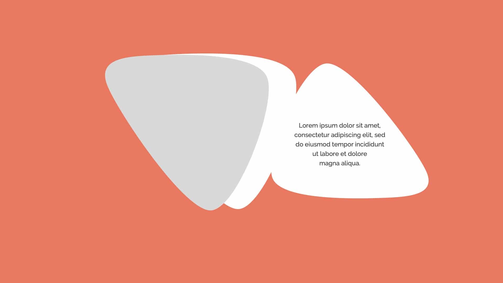
Look for elements of your brand that can be repeated. It's a bit like a musical hook or a guitar riff. It's repeated throughout and becomes memorable. Here's a simple example of how brand elements can be used in presentation design so that the slides remain consistent visually but not boring :


This is a fairly simple example to illustrate the point. You can get much, much more creative with it. Have you ever been on a training course and you have had to think of 50 ways to use a paperclip? No? The idea is to break out of the thinking of what a paper is used for and manipulate the clip into many other forms. Think of your brand as that paperclip. The trick is to manipulate it in interesting ways but don't change it so it's unrecognisable.
Let's take a more complex example where we have created a brand image centred around these simple shapes, a cube and metal spheres. Let's call it a jewelry brand :-

Here's some ideas on how we can manipulate the elements and push it into other directions but keep the same visual language :-


And there you have it. Keep looking for opportunities to re-contextualise your brand imagery. Put the brand in unusual situtations, play with the form of the brand to invent spin off attributes, additional shapes, colours, textures, all linking back to the core brand imagery.
If you're looking at how to bring your brand alive, have a peak at our brand storytelling services and get in contact for a no obligation chat or if you need a branded presentation, have a look at our presentation design services. The above images were all created in-house, so do get in touch in you need fresh brand imagery developed.
Subscribe to The Story Mill Blog
Get the latest business storytelling and visual communications news, tips/advice & resources
Thanks for subscribing. Please check your email to confirm your subscription.
Oops! Something went wrong while submitting the form.

