Top PowerPoint Presentation Examples & Tips
IN
Visual Communication
Top creative Powepoint examples and tips to build better presentations
Written by
David Taylor
Creative PowerPoint Presentation Examples for Inspiration
Design CAN be subjective, however, when it comes to Powerpoint presentations, there are defintely some rules that you should follow to ensure your content lands well, is understood and encourages the desired behaviour and/or outcomes.
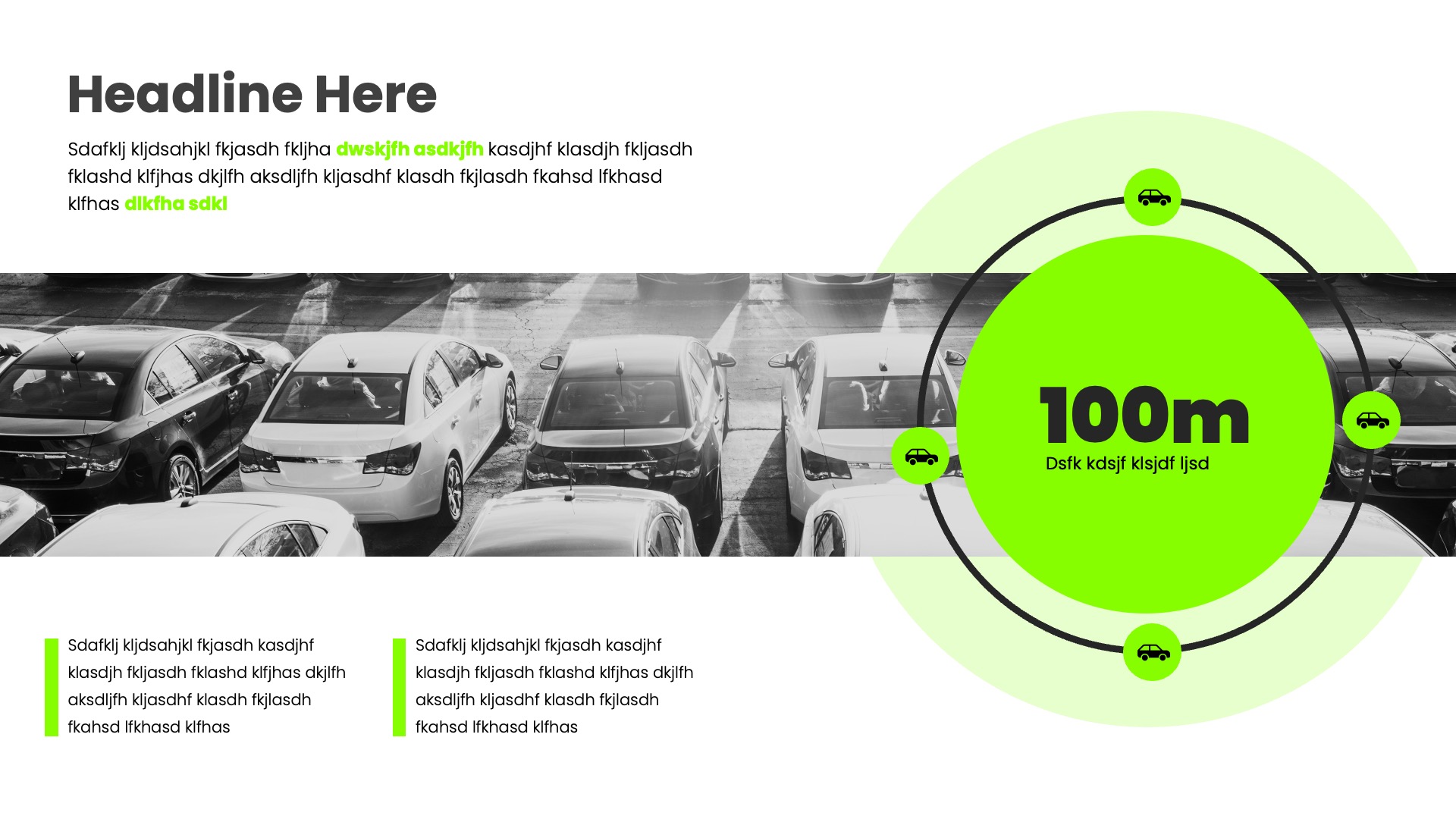
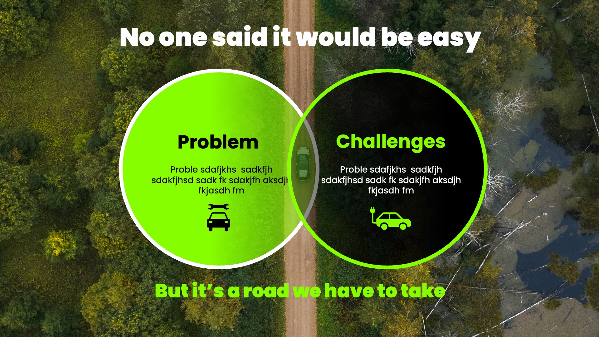
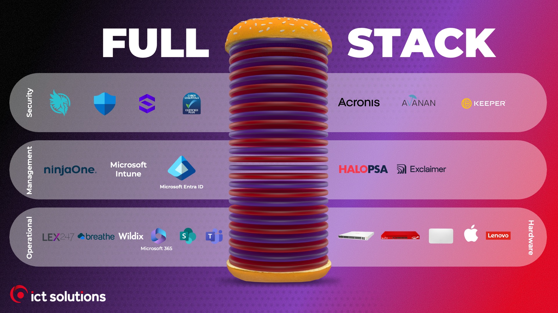
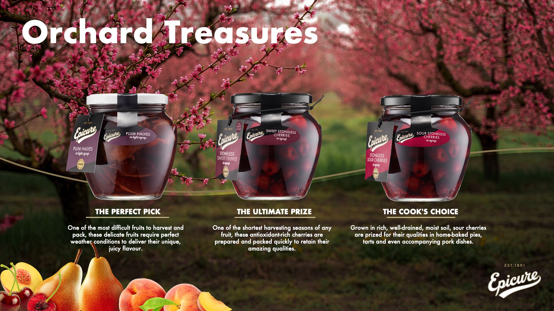
For your inspiration, here are just a few samples, to kick start your creativity/inspiration


So what can you do to make sure your Powerpoint presentations are successful?
Ever found yourself staring at a wall of text on a slide, wondering if you were supposed to read it or listen to the speaker? We’ve all sat through these “Death by PowerPoint” presentations, and the fear of creating one ourselves is real. When faced with a blank slide, it’s tempting to just start typing out everything we want to say, turning our presentation into a script for the audience to read along.
The good news is, avoiding those boring PowerPoint slides is easier than you think. The fix starts with understanding the single biggest mistake people make: treating slides like a document instead of a visual aid. Your slides aren't there to contain every word; they are there to support the words you are speaking by creating impact and adding clarity.
A better approach is to think of each slide as a billboard on the highway. Presentation experts often talk about the "glance test," noting that your audience should be able to understand the gist of a slide in just three seconds. A driver doesn't have time to read a paragraph on a billboard, and your audience doesn't have the attention span for a cluttered slide. This simple mental shift is the key to learning how to make a presentation visually appealing.
This “billboard test” is the foundation for all good slide design because it naturally leads to the most powerful rule: one concept per slide. The creative examples that follow show exactly how this single principle works in practice, transforming dense slides into presentations that are clear, professional, and impossible to ignore.
How to Transform a Boring Bullet Point List into Engaging Slides
It’s tempting to take a list of ideas and drop them onto a single slide as bullet points. While it feels efficient, it creates a major problem: your audience starts reading your entire slide instead of listening to you. The moment they read ahead, you’ve lost their attention. This common mistake is the number one cause of boring PowerPoint slides, turning a dynamic presentation into a shared reading exercise where you are no longer the guide.
Instead of listing your points, give each one its own moment in the spotlight. This technique involves deconstructing your list and turning each bullet point into its own separate slide. If you have four key project goals, you now have four clean, focused slides. Each slide should feature a simple headline and a short sentence. This approach transforms a dense wall of text into a clear, step-by-step story that is easy for your audience to follow.
By breaking up your information this way, you control the pace of your presentation and build momentum. Your audience stays with you, focused only on the point you are currently making. This simple change is a core part of effective slide storytelling and is essential for creating professional business pitch deck slides that hold attention. Of course, these new, focused slides now have a lot of empty space. So, what do you fill it with?
Where to Find Stunning (and Free) Images That Don't Look Cheesy
I mentioned above about filling the space, a point of caution here. Space is your friend. It can help draw attention to the content you want to highlight. Get really comfortable with including plenty of space on your slides. So that said, you'll probably (and should) use high quality images to enhance your slides message(s). Where do you find high quality images?
Thankfully, you no longer have to rely on generic clip art or watermarked photos. There are amazing websites that offer beautiful, high-quality pictures that are completely free to use. This is often called "royalty-free," which simply means you can download and use them in your projects without paying or worrying about legal issues. Here are three of the best places to start your search for creative presentation ideas:
Using a sharp, modern image from one of these sites is one of the fastest ways to make a presentation visually appealing. It tells your audience that you care about quality and helps build credibility before you even say a word. It’s a simple trick that elevates basic slides into a professional business pitch deck. With sources for amazing visuals secured, the next step is learning the best way to use a single, powerful image to create a high-impact slide.
How to Use a Single Image to Create a High-Impact Slide
Instead of treating your new, high-quality image like a small postage stamp on a big envelope, let it become the entire background. Stretching a single, powerful photo to fill the whole slide is a core principle of modern slide design. This technique instantly feels more modern and cinematic, pulling your audience directly into the world you're creating. It’s one of the simplest ways to find some minimalist presentation design inspiration for your next project.
The immediate challenge, however, is that your text can get lost on top of a busy picture. The solution is surprisingly simple: place a semi-transparent colored shape (like a dark gray or blue) over your image, and then put your text on top of that shape. As you can see in the example below, this simple “overlay” makes your words pop, ensuring perfect readability while still letting the beautiful image shine through.

This approach does more than just look good; it creates an emotional connection. A full-screen image immerses your audience in an idea, while a small image next to bullet points just feels like a report. It’s a simple shift that helps you build one of the most engaging presentation slide templates for your own use. But what color should that overlay be? Choosing the right colors is just as important as choosing the right image. A great place to start is with the '3-Color Rule'.
The '3-Color Rule': A Simple Trick for a Professional Color Scheme
One of the quickest ways a presentation goes from polished to chaotic is by using too many colors. Have you ever seen a slide with a red title, blue text, and a green chart? It’s confusing and looks unprofessional. The secret to achieving good slide design is to limit your palette. The “3-Color Rule” is your new best friend: pick one main color, one secondary accent color, and one neutral color (like white, gray, or black) for your text. This simple discipline is fundamental to a visually appealing presentation.
Struggling to pick those colors? Here’s a foolproof method: use your company’s or school’s logo. Logos are professionally designed to have a balanced color scheme, so you can borrow their expertise. Simply use the main color from the logo as your primary color, and a secondary logo color (or a lighter/darker shade of the main one) as your accent. This instantly makes even simple slides feel like cohesive, on-brand presentations.
With your colors chosen, you have a simple system. Use your main color for key information you want to stand out, like a headline or an important number on a chart. The accent color can be used more sparingly for things like subheadings or decorative lines. Finally, your neutral color ensures your text is always easy to read. Speaking of readability, the colors are only half the battle; the font you choose is just as important.
Choosing the Right Font: An Easy Win for Readability
Just like messy colors can make a slide hard to look at, the wrong font can make it hard to read. The easiest way to get this right is to understand one simple difference. Have you ever noticed how some letters have tiny decorative “feet” on them? Those are called serif fonts (like Times New Roman). Fonts without those feet are called sans-serif (like the text you’re reading now).
For presentations, the rule of thumb is simple: stick with sans-serif fonts. Their clean, simple lines are much easier for an audience to read on a screen, whether it’s a giant projector or a small laptop. This is a core principle of effective presentations, ensuring your message is clear and your slides look modern. Using a sans-serif font is an instant upgrade that makes any presentation, from a class project to a high-stakes business pitch, feel more polished.
You don't need to hunt for anything special; your computer already has great options. For a look that provides minimalist presentation design inspiration, stick to one of these safe, professional choices:
- Calibri: Modern, soft, and friendly.
- Arial: A classic, no-nonsense font that’s always a safe bet.
- Helvetica: The choice for a clean, sharp, and professional feel.
With a consistent color scheme and a readable font, your slides now have a strong visual foundation. But what you put on them—and in what order—matters even more. The best approach is to structure your presentation like a simple story.
How to Structure Your Presentation Like a Simple Story
A great presentation isn’t just a collection of facts; it’s a story. Think about it: our brains are wired to remember narratives, not bullet points. Once you have a clean look for your slides, the most powerful way to organize your ideas is by using a simple storytelling structure. This approach is the secret behind many effective business pitches and is surprisingly easy to apply to any topic.
The most effective guide to slide storytelling uses a three-act structure: Problem, Solution, and Benefit. This framework instantly gives your presentation a logical flow that grabs and holds attention. You start by introducing a challenge your audience recognizes (the Problem), then you present your idea or finding as the answer (the Solution), and finally, you explain the positive outcome for them (the Benefit).
This structure works for almost any scenario. Wondering how to structure a business presentation on a new software tool? Start with the problem of wasted time (Problem), introduce the new software (Solution), and show how it saves 10 hours a week (Benefit). Doing a school report on renewable energy? The problem is pollution, the solution is solar power, and the benefit is a cleaner planet.
Organizing your presentation this way does more than just make it interesting; it makes it persuasive. It answers your audience’s unspoken question: “Why should I care?” By framing your information as the solution to a meaningful problem, you make your message stick. This narrative even provides the perfect context for data, which you can use to prove just how big the problem is or how great the benefit will be.
Making Data Simple: The 'Highlight One Thing' Technique
Once you have your story, you often need data to prove your points. This is where many presentations get bogged down. The common mistake is to paste a chart or graph directly from a spreadsheet, leaving your audience to decipher a sea of bars and lines. But a data slide shouldn’t be a puzzle. Its goal is to deliver a single, clear message in under five seconds. If your audience has to ask, “What am I looking at?” you’ve already lost their attention.
The most effective way to achieve this is with a simple but powerful technique: colour contrast and highlighht one thing
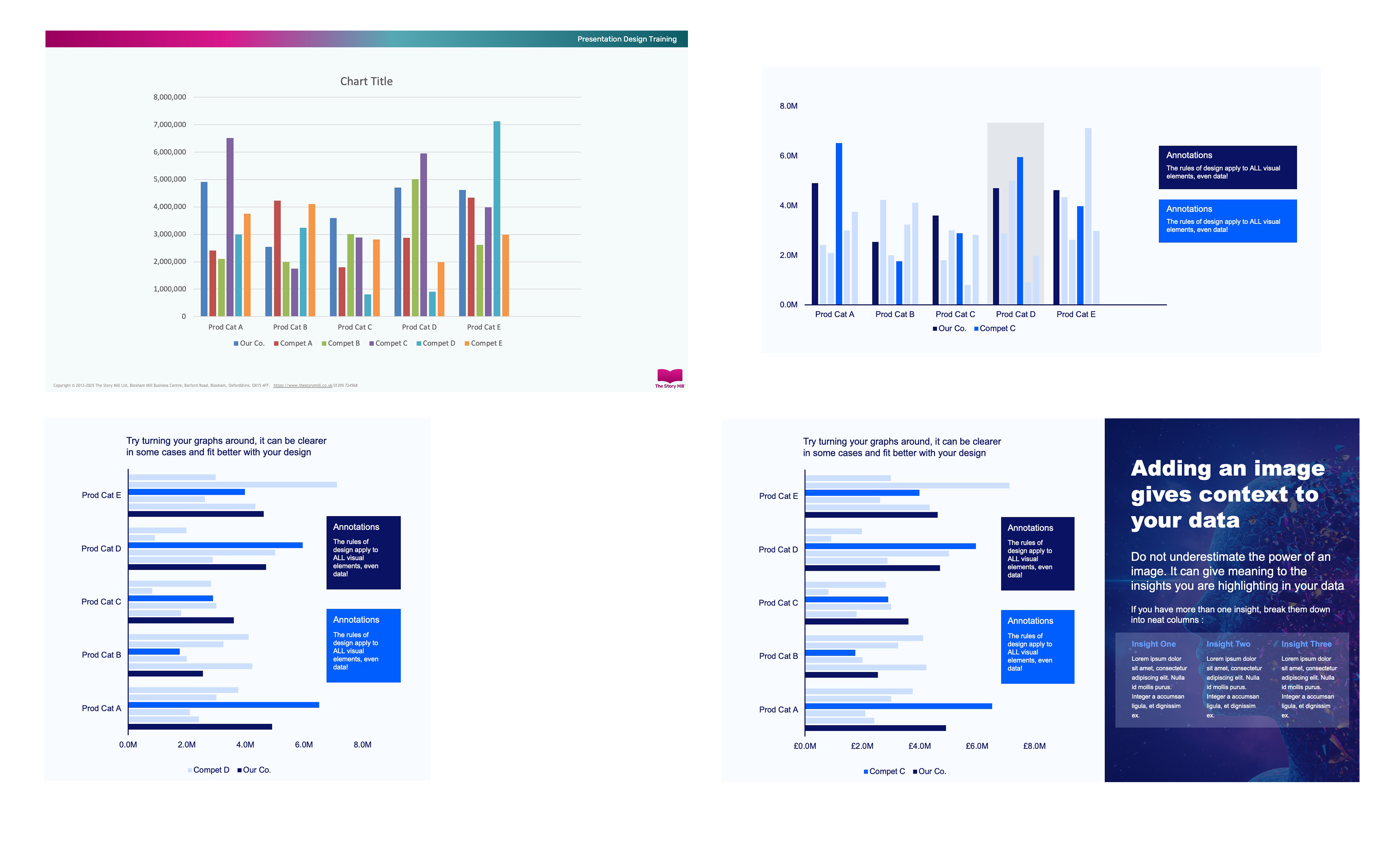
Using contrast is a very powerful way to draw the eye to the data that is most relevant to your slide. The four slides above shown a simple example of taking messy data and organising it into a simple chart with greater impact and eventually bringing in an image to further enhance and explain the communication.
This simple trick does more than just improve your slide’s appearance; it makes your point more persuasive. You're doing the analytical work for your audience, guiding them to the same conclusion you reached. This demonstrates confidence and clarity, which are the cornerstones of effective slide design. It transforms your chart from a passive display of information into an active piece of evidence, regardless of which presentation tool you ultimately use.
PowerPoint vs. Canva: Which Is Best for a Quick, Modern Design?
While the techniques we've covered will improve your slides in any program, the tool you choose can make the process easier. Think of the difference between PowerPoint vs. Google Slides design and Canva like cooking. PowerPoint is a fully stocked kitchen; it gives you total control over every ingredient, but you need to know how to combine them. Canva, on the other hand, is more like a meal-kit service. It provides a recipe and pre-portioned ingredients, guiding you toward a great result.
The power of Canva presentation templates is that professional design principles are already baked in. Instead of starting with a blank slide and worrying about fonts, colors, and layouts, you start with a structure that already looks modern and balanced. For someone who isn’t a graphic designer, this completely removes the guesswork and is often the fastest path to creating a presentation that looks polished and impressive.
If you want to expore other presentation tools you may would to read this blog article on alternatives to Powerpoint.
So, here’s a simple rule: if you need deep, granular control or have to follow strict corporate brand guidelines, PowerPoint’s flexibility is essential. But if your main goal is to create a beautiful, engaging presentation quickly without a design background, Canva is often the best presentation software for design. Regardless of the tool, the core principles of clarity and focus are what matter most. To tie everything together, here is a simple checklist to help you nail your next presentation.
Your 5-Minute Checklist for a Presentation That Wows
You no longer have to stare at a blank slide and wonder where to begin. Where you once saw a daunting task, you can now see a clear path forward. You’ve moved beyond the default templates and walls of text, armed with the knowledge of how to make a presentation visually appealing by making simple, intentional choices.
Before you finalize your next presentation, use these quick presentation design tips as a final quality check. Run through this 5-point checklist to ensure your message is clear and powerful:
- One Idea per slide
- Use strong full screen images
- Stick to the 3 colour rule
- Clear a clear story
- Hightlight the key takeaways
This simple guide to effective slide storytelling isn't about becoming a graphic artist overnight. It’s about learning to respect your audience’s attention. You now see that a great presentation isn’t built with complex features, but with clarity. Go forward and create something your audience will not just understand, but remember.
YOU MAY ALSO LIKE


Subscribe to The Story Mill Blog
Get the latest business storytelling and visual communications news, tips/advice & resources
Thanks for subscribing. Please check your email to confirm your subscription.
Oops! Something went wrong while submitting the form.